A website is all about words, colours and pictures, but how you use these elements is the key to creating a great user experience. Websites have evolved over the years and people are looking for a lot more in websites these days than just information. From entertainment and interactions to adding engaging visuals, websites are becoming an experience. You could create such amazing things websites too.
If you are wondering how to become a web designer, you have to first take up a course that will teach you the nitty-gritty of being one. There are many web designing courses online that will teach you to create customised website designs for the brands you will work with in the future.
However, there are a few hacks you could follow to design user-friendly websites. Read on.
Easy Navigation
Rocket science is complex and difficult to understand, which is why not everybody comprehend it. But a website should be the opposite of it – easy to understand and navigate. So do not try to design something so fancy that people find it too complicated. It is usually a good idea to stick to the tried and tested tools and create user-friendly websites. User friendly websites are those that are mobile compatible, accessible to users including the disabled and elderly, have a faster page load time, contrasting colour scheme, a good and clutter-free navigation, and have an excellent search feature.

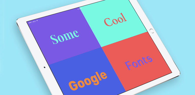
Simple Fonts
It is best to use fonts that are easy to read so that the reader stays on your website for a longer time. Otherwise, bounce rate of the website might increase. Choose fonts that have fewer curves or embellishments. The last thing you want is to turn away a reader because you used flashy fonts that are too difficult to comprehend. It is one of the many important things you will learn in your website designing course. You can add an option to increase or decrease the font size. So, this way, readers can magnify text that is not clearly visible to them and still enjoy the content posted on your site.

Visual and Words
The world has shifted to more visual depictions. So, make sure that your website has enough visual representations to support your text. For example, most websites have social media icons instead of actually spelling out the name of the platform and text explaining that you can connect better on it. It is like music and lyrics. While both can do great on their own, the song turns out to be much better when you combine the two.
Hi-Speed
User-friendly websites emphasise on speed, especially on mobile devices. If it takes too long to load, users will leave the very next second. So make sure that you check the speed or load time of your website while designing it so that you do not lose your web audience. There are many online sites that allow you to check your web speed and page load time, and give you tips on how to speed it up.
Responsive Websites
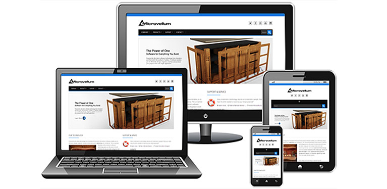
You want to ensure that people web browsing on laptops and desktops find it equally easy to navigate through your websites on their smart phones and tablets. This will increase your visibility on search engines which means more traffic on your website. Look at some of the most popular websites as references, which are easily accessible on smaller devices either on a browser or through applications. It is a huge win.

To become a professional website designer, you may join a website designing course at MAAC and learn from the experts that what it takes to be an expert web designer. You will get complete guidance to shape your career in the right way.


