Wish to know what’s hot on the internet? Here are the top five trends that have been doing rounds in the world of web design.
Flat design
This is going to be apparent in a lot of digital design that we will see this year. Web design companies, in particular, are showing a lot of interest in flat design. This is mainly due to the fact that flat design is very popular in operating systems such as Android or even the new iOS7. It is easy to configure because it does not rely on CSS, and is instead based entirely on the colours or layouts that the designer chooses to use.
[youtube]http://www.youtube.com/watch?v=wc59EDQ_qkQ[/youtube]
Large images and video
Our attention spans are getting really short. Consumers don’t want to read on the internet for a long period of time. The message has to be sharp and quick. Thus, the focus is shifting from text to large images and videos. Armed with server farms and super fast processors, designers are now coming up with colour rich images and high definition videos to populate web pages and get their ideas across. For example, Tumblr features rich media that people scroll across instead of reading the text.
Colour
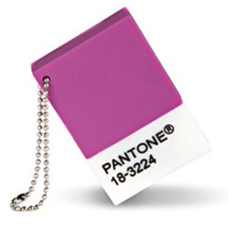
For those of you who don’t know, the Pantone Colour of the Year is Radiant Orchid. Be prepared to see and use this colour a lot in design this year. Designers across verticals such as industrial design, furniture and interior designing among many others intend to use this colour to the maximum.
Hand drawn illustrations
Google Doodle is always an interesting image. The ingenuity comes from the fact that each doodle is drawn by hand. We will definitely be seeing more hand-drawn illustrations in the year 2014. Rendered images are falling out of style as people are taking more interest in hand-drawn artwork. Calligraphy and typography are two fields in particular that will get a major impetus out of this trend.
[youtube]http://www.youtube.com/watch?v=NWIruxSx22Q[/youtube]
Gradients
Gradients used to be really popular but then they went out of style and demand. Gradients are now back in style as printing technology has moved light years ahead. As opposed to the earlier years when gradients were only used on backgrounds, designers are now coming out with gradients in text. The resulting design appears crisp and beautiful. For example, the new iOS7 features rich gradients in its overall design.
If you know more interesting web designing trends, share them with us in the comment box below.


