A picture is worth a thousand words.
This idiom holds most true for logos. From texts to symbols, company & brand logos are the identity that surrounds us everywhere. Whether floral & artsy or minimalist & flat, evolution of logo design has influenced generations, and are a reflection of the period, and the product philosophy. Based on the simple rule of shapes & symbols, logos are important to represent a company in the desired light, and create brand recall & loyalty.
Since it would be difficult, and unfair, to crunch the whole history in just one blog post, we decided to break it up into three parts – early years, middle years, and modern times. In this first part, we begin with the early years of evolution of logo design.
1837 – 1901: VICTORIAN ERA – Early symbolism
Queen Victoria remains an important figure in every aspect of history. From Victorian literature to Victorian architecture, her influence is visible globally. She also remains a benchmark in the evolution of logo design. The Victorian Era is known to have encouraged artists & instwogram, and the influence is evident in the field of graphic design as well. Symmetrical layouts, heavy ornamentation and decoration remain characteristic of the period. So which logos were results of the Victorian Era?
Pepsi – The gothic typeface

The present-day Pepsi logo has a long & fascinating history. It started with a Gothic typeface that was first used in 1898 when Brad’s Drink became Pepsi-Cola Company.
The royal typeface

Ornamentation & decoration became a constant feature of the period. Typefaces during this period witnessed a heavy use of ornate elaborations, shadows, outlines & embellishments.
Valvoline – Industrial breakthrough

The leading motor oil & automotive lubricant provider, Valvoline, paved the way for commercial logos. Designed in 1886, the Valvoline logo became the first prototype of commercial logos. The Victorian style was maintained with an arched out sphere and small dots within it.
1880 – 1910: ARTS AND CRAFTS – The days of decorative & fine arts
This period remains the most significant in the evolution of logo design. It not only redefined the use of decorative elements like heavy textures & illustrated initials, but also highlighted the importance of simple forms in medieval, romantic & folk styles. This period bridged the gap between traditional Victorian era designs and the modern movement.
Jack Daniel’s (1875) – High on flora

A dominant feature of this period was the use of curved outlines with a flat design & minimum illustrations. Over the years, Jack Daniel’s has maintained its ‘Old No. 7’ logo, one of the most popular logos in the beverage industry worldwide.
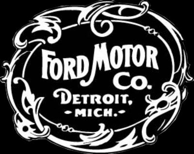
Ford (1903) – Flower power

Ford Motors got its first logo in 1903, and it was no different from the art of the day. Though the logo has gone a number of changes over the years, it continues to maintain a touch of floral in the flow of the typeface, and the original Ford logo is still considered to be one of the world’s best automobile logos.
1890 – 1920: ART NOUVEAU – The new age
Art Nouveau is a popular milestone in the art world. It is characterised by flat, outlined illustrations and hand-drawn typefaces. This period was crucial in the evolution of logo design as designers adopted natural forms and structures in their logo designs.
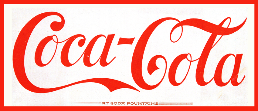
Coca-Cola – The timeless

The history of Coca-Cola logo is possibly one of the most documented & studied in the world of graphic design. Designed in the 1920s in the Spencerian script, the Coca-Cola logo has survived changes & influences. It was also instrumental in paving the way for Arciform or fishtail logos.
General Electric – Coming of age

Although the logo has been modified over a period of time, the GE logo carries forward the flavour of the original Art Nouveau logo designed in 1892. It continues to be considered one of the best examples of art nouveau graphic designs.
Mercedes – The arty flowers

Mercedes’ art nouveau logo had a three-pronged star with a floral border that symbolised the company’s ambition to dominate air, land & sea. Although the logo has evolved but the star remains one of the most recognised logos around the world.
Versace – Greek roots

The iconic logo for famous fashion brand is one of the most peculiar examples of the art nouveau period. It uses abstract lines to form a decorative pattern like a maze encircling the head of Medusa, a Greek woman transformed into a monster by the goddess Athena for her wrongdoings. The logo concept was chosen by Gianni Versace who was fascinated by the myth of Medusa, and considered his designs to have the same power to stun people with their absolute beauty and make them stop dead in their tracks.
Ornamental work
This period also witnesses complex logos that were born from classic philosophies & influences. These featured floral lines, a maze-like structure, typography, and mostly a crown-like figure.
The birth of negative space
This period was also significant in bringing negative spaces to the forefront. Some of the most popular logos of this period prominently featured negative space filled by simple forms of nature.
In the next blog post we will take a look at the period that shaped the style of modern-day logo design.


